
How a 500 Year Old Map Still Distorts Our World
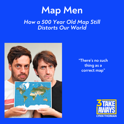
The world map we grew up with makes Greenland and Africa look the same size. The problem? Africa is actually an astonishing 14 times larger.
The even larger problem? There's no such thing as an accurate map. They all distort how we see the world.
Jay Foreman and Mark Cooper-Jones are comedians, writers, and YouTubers with millions of followers where they are better known as Map Men. Their new book, This Way Up, explores how maps shape our understanding of the world and what happens when they inevitably get it wrong.
They discuss:
● Why a 500-year-old deeply-flawed map became our standard picture of the world
● Why Greenland and other northern countries appear much larger than they really are
● Why creating a completely accurate flat map is impossible
● Why north being “up” is simply a convention
● How a country’s apparent size and position may shape how important we believe it is
● Why Google Maps can display different borders depending on where it is viewed
● What London taxi drivers reveal about navigation, memory, and the brain
● How relying on GPS is weakening abilities we once took for granted
● What GPS and AI have in common
Maps look objective, but they're actually very subjective and flawed. Where and how are they misleading us?
And if you're looking for a more topical take on Greenland, Trump, and the recent security deal -- be sure to tune in next week for my conversation with security expert Heather Conley.
Did you enjoy this episode? Consider leaving a review on Apple Podcasts, Spotify or your favorite podcast platform.
Receive updates on upcoming guests and more in our weekly e-mail newsletter. Subscribe today at www.3takeaways.com.